Pattern for Goudy Old Style (Typeface Series number: 291)


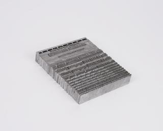
Pattern for Goudy Old Style (Typeface Series number: 291). 10 point. Copper plate backed with lead. In original wooden tray. Manufactured by Monotype Corporation.
Frederic Goudy (1865–1947) was one of America’s best known and most prolific type designers of metal type. Goudy’s work, like that of his fellow American, Bruce Rogers, linked the era of the great private presses with that of the typographical revivals of the 1920s. Goudy Old Style was first cut in 1915 for traditional founders American Typefounders and is regarded by many critics as one of his finest designs. It became available for use on Monotype machines from 1930 onwards. As with so many of his faces, Goudy began to design this face with historical models in mind. The capitals were modelled on Renaissance lettering, but as also often happened, the finished design bore little relation to the model. However it is notable for the strong imprint of the designer’s personality and the skilful adaptation to the purpose for which it was intended.
The roundness of the letters and the flowing curves are characteristic of Goudy’s work. The very short descenders and the evenness of colour contribute to the very practical qualities of the typeface. Apparently the designer regretted the shortness of the descenders. The serifs are small and not sharp; the ‘Q’ has an external tail; and the ear of the ‘g’ flicks upwards.
The Monotype Corporation manufactured 16 sizes from 6pt to 72pt between 1930 and 1940. Sales were good and particularly high for 8pt, 10pt and 12pt. A companion bold with italic is also available.
Details
- Category:
- Printing & Writing
- Collection:
- Monotype Corporation Collection
- Object Number:
- 1995-1107/2
- Materials:
- copper (metal), lead (metal), metal (unknown) and wood (unidentified)
- Measurements:
-
overall: 360 mm
overall (tray, exc. handle): 40 mm x 280 mm x 360 mm
- type:
- pattern


