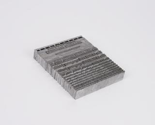
0.2 inch composition punches for Univers Medium Expanded (typeface series number: 688)

![]() This image is released under a CC BY-NC-SA 4.0
Licence
This image is released under a CC BY-NC-SA 4.0
Licence
Buy this image as a print
BuyLicense this image for commercial use at Science and Society Picture Library
License0.2 inch composition punches for Univers Medium Expanded
Science Museum Group
© The Board of Trustees of the Science Museum
0.2 inch composition punches for Univers Medium Expanded (typeface series number: 688), font size 12D. In an original wooden box. Manufactured by Monotype Corporation.
A Monotype punch is made by tracing a pattern on a vertical pantograph machine. It is an engraved piece of hardened steel of a reverse-reading type character (letter, numeral or ornament) in relief from which the matrices are made. After cutting, the face of the punch was ground to the correct measurements denoted on the relevant chart. The punch was stamped into a piece of phosphor bronze that made a matrix from which type could be cast. Punches were made in standard sizes: 0.2" x 0.2", 0.4" x 0.4", 1" x 1", or 1" x 1.35". If a Monotype punch became damaged it could be replaced, identically, using the pattern.
The Univers typeface did not originate with The Monotype Corporation. It was designed by Adrian Frutiger in 1957 for traditional typefounders Deberny & Peignot of Paris. It was named because of its aim for universal usefulness. Univers was made in 21 different styles with a decimal system of classification indicating weight and width, such as 40 for light, 50 for medium, 60 for bold and where 3 denoted expanded, 7 condensed, and 9 extra condensed. All of the sizes and weights were designed in relation to one another to produce a harmonious scale of weights. Univers was one of the first typefaces to be planned from the start as a family of consistent related designs. Previously it was quite normal for there to be greater variation between weights and styles. With Univers only the proportions of strokes and letters vary and the basic bowl shapes. For example, the capital ‘O’ is almost straight-sided in the extra condensed compared to the rounded wide ‘O’ of the expanded versions.
Univers was the first typeface to be manufactured simultaneously as foundry type for hand-setting, for hot-metal composition, and for phototypesetting. In 1958 the new typographic adviser at The Monotype Corporation made the decision to embrace the Univers type family and the company manufactured it from the early 1960s onwards. It involved a heavy investment in time and required a lot of physical space.
The letterforms are based upon the nineteenth-century style of sans serifs called Grotesques and are not completely monoline. The apparently unstressed and serifless letter has on closer examination got a slight vertical stress, especially in the heavier weights, and a faint broadening of the tips of vertical strokes. These traces of stress and serif assist the horizontal flow of the line. The close fit of letters, the large x-height and clear legible letterforms produce evenly coloured pages. A vestige of serif is to be found on most vertical straight strokes such as lowercase ‘h’ and ‘q’. Some letters also have a slight turn in the direction of seemingly straight strokes such as lowercase ‘a’ and ‘d’. Where strokes meet at an acute angle and an effect of heavier weight might be produced, the width of stroke is very slightly tapered such as with capital ‘W’ and lowercase ‘w’. The capitals are the same height as lower case ascenders and terminals are sheared off horizontally. The tail of the capital ‘Q’ is horizontal; the lowercase ‘a’ is a traditional double-storey design, and the capital ‘R’ has a curved tail. The Monotype medium and condensed widths have their own accompanying italics but Univers Medium Expanded does not.
Univers was very successful for Monotype as a metal typeface despite being released during the 1960s when another type technology was becoming more prominent. It has appealed to designers because of the many styles and weights to choose from and its neutrality.
Details
- Category:
- Printing & Writing
- Collection:
- Monotype Corporation Collection
- Object Number:
- 1995-1108/60
- Materials:
- metal (unknown), steel (metal) and wood (unidentified)
- Measurements:
-
overall: 30 mm x 155 mm x 255 mm,
- type:
- punch - marking tool