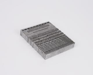
0.2 inch composition punches for Baskerville (typeface series number: 169)
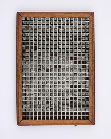
0.2 inch composition punches for Baskerville (typeface series number: 169), font size 8. The box is marked with suffix a-z meaning a-z. In an original wooden box. Manufactured by Monotype Corporation.
A Monotype punch is made by tracing a pattern on a vertical pantograph machine. It is an engraved piece of hardened steel of a reverse-reading type character (letter, numeral or ornament) in relief from which the matrices are made. After cutting, the face of the punch was ground to the correct measurements denoted on the relevant chart. The punch was stamped into a piece of phosphor bronze that made a matrix from which type could be cast. Punches were made in standard sizes: 0.2" x 0.2", 0.4" x 0.4", 1" x 1", or 1" x 1.35". If a Monotype punch became damaged it could be replaced, identically, using the pattern.
A new look came to English type design with the typefaces of John Baskerville (1707–1775). Baskerville was an accomplished writing master and innovative printer from Birmingham, England. His typefaces are classified as Transitional: designs with some Old Face characteristics but also some that foreshadow the development of Modern faces. Baskerville’s letterforms were very wide and he was the first to move in the direction of vertical stress, which is why the type is considered to be the first of the Transitional romans in England. His printing is noted for the importance he attached to the quality of paper and presswork and for his imaginative handling of type in relation to space. Although Baskerville’s type influenced a few printers, most English printers continued to use Caslon, which is classified as an Old Face. Baskerville types were ‘rediscovered’ in 1917 and several revivals followed.
The Monotype Corporation cut the first sizes of Baskerville Series 169 in 1923. Its generous proportions make it one of the most handsome, as well as one of the most legible, of typefaces. The width of the letters counteracts the vertical pull of the stress, and the open counters and clean, crisp lines mean it prints well. The serifs are bracketed and cut off at the tips. Distinctive features in the design include the absence of a middle serif on the roman and italic capital ‘W’ and lowercase ‘w’. In the roman and italic ‘g’, the lower bowl is not closed, and the ear is curled.
The influence of handwriting is noticeable in the accompanying italic and it is narrower and lighter than the roman. The italic includes a number of fine semi-swash letters such as the capitals ‘J’, ‘N’ and ‘Z’ but there are plainer alternatives available too. There are two related faces, a bold and a semi-bold, each with italic.
Monotype produced Baskerville roman and italic in 20 sizes, from 6pt to 72pt between the years 1923 and 1963. Sales were very good for this exceptionally popular continuous text typeface.
Details
- Category:
- Printing & Writing
- Collection:
- Monotype Corporation Collection
- Object Number:
- 1995-1108/2014
- Materials:
- metal (unknown), steel (metal) and wood (unidentified)
- Measurements:
-
overall: 43 mm x 155 mm x 255 mm,
- type:
- punch - marking tool
