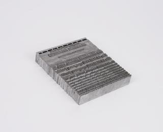
0.2 inch composition punches for Gill Sans (typeface series number: 262)

0.2 inch composition punches for Gill Sans (typeface series number: 262), font size 8. In an original wooden box and no suffix relating to the typeface is marked. Manufactured by Monotype Corporation.
A Monotype punch is made by tracing a pattern on a vertical pantograph machine. It is an engraved piece of hardened steel of a reverse-reading type character (letter, numeral or ornament) in relief from which the matrices are made. After cutting, the face of the punch was ground to the correct measurements denoted on the relevant chart. The punch was stamped into a piece of phosphor bronze that made a matrix from which type could be cast. Punches were made in standard sizes: 0.2" x 0.2", 0.4" x 0.4", 1" x 1", or 1" x 1.35". If a Monotype punch became damaged it could be replaced, identically, using the pattern.
The Monotype Corporation successfully commissioned Eric Gill (1882-1940) to produce nine original typefaces, which over the years generated 40 series for the Monotype hot-metal typeface library. Gill is arguably the most important British type designer of the twentieth century. He was a prominent artist-craftsman who was awarded the title of Royal Designer for Industry. Two of Monotype’s bestselling typeface families were Perpetua and Gill Sans, both original Gill designs, that developed from his experience with lettering on paper and stone.
Gill Sans is a sans serif design that has the proportions of classical roman letters. It retains subtle contrasts in stroke widths that make it more readable in continuous text than mono-weight type. The designs of lowercase ‘a’, ‘g’ and capital ‘R’ are not typical of this category of sans serifs. The form of the lowercase a – known as two-storey – and the ‘g’ – likened to a pair of glasses – are traditionally associated with serif letters. The capital ‘R’ is a signature letter for Gill with its distinctive curved leg. It is a good place to start when trying to identify a Gill typeface as he settled on this form and did not deviate from it.
Matrices for this series were made in 25 sizes, from 5pt to 72pt, and the first sizes were released in 1929. The Gill Sans family spawned many weights and styles such as Ultra Bold and Shadow, each with different series numbers.
The immensely successful design made the transition from metal to filmsetting technology and then to digital technology. Over the decades Gill Sans has seen widespread usage by British companies such as London & North Eastern Railway, Penguin Books and the BBC, and on personal computers in the western world.
Details
- Category:
- Printing & Writing
- Collection:
- Monotype Corporation Collection
- Object Number:
- 1995-1108/2383
- Materials:
- metal (unknown), steel (metal) and wood (unidentified)
- Measurements:
-
overall: 43 mm x 155 mm x 255 mm,
- type:
- punch - marking tool


