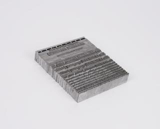
0.2 inch composition punches for Bembo (typeface series number: 270)
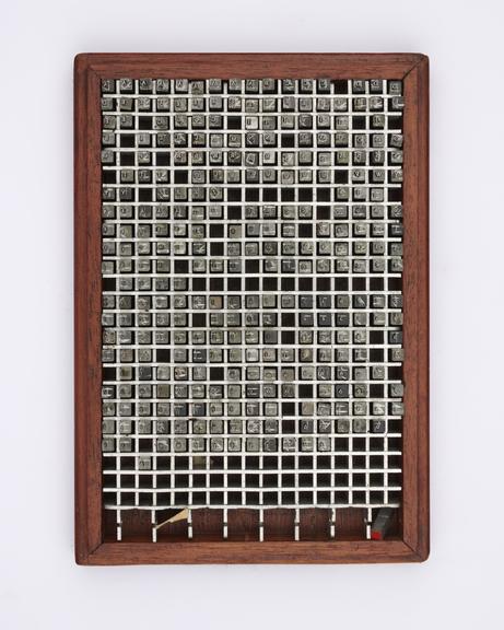
0.2 inch composition punches for Bembo (typeface series number: 270), font size 6. The box is marked with suffix Rm Acc's meaning Roman; Accents. In an original wooden box. Manufactured by Monotype Corporation.
All Old Face designs up to the time of Caslon can be traced back to a roman type which Francesco Griffo cut for the Venetian printer Aldus Manutius. The first of these, used for Cardinal Bembo’s tract de Aetna in 1495, was the original upon which Monotype Bembo is based and named. Esteemed typographer Stanley Morison’s research showed that it was the model followed by Garamond and the forerunner of the standard European type of the next two centuries. Bembo was carefully redrawn to capture the spirit and intention of the original as part of an effective type design programme at Monotype. The first size of Bembo was released in 1929 and many more followed over the years. The functional serifs and comfortably balanced letters make it a very legible face in all its sizes.
Bembo is classified as an Old Face design due to the diagonal stress, bracketed serifs and the lowercase top serifs cut off on the slant. Monotype described the design as ‘free from peculiarities’. The letters by which the face can be most easily identified are the square ‘H’; the round ‘O’ with back-tilted axis; the curved arm of ‘K’; the flat top of ‘A’; the flattened foot of ‘J’; and the splayed base of ‘M’. There were two versions of capital ‘R’, with the leg protruding to different lengths. The capitals are slightly shorter than the lowercase ascenders. In the lowercase there is no point or serif to the foot of ‘b’; an upturned foot to ‘d’; long heavy cross-stroke to ‘t’; large loop and heavy wedge ear to ‘g’. The final stem of ‘h’, ‘m’, and ‘n’ each has a subtle curve inwards.
There were two italics designed to accompany the regular weight of Bembo. The first italic was the only typeface designed by calligrapher Alfred Fairbank and it became a separate series known as Condensed Italic. The companion italic was also calligraphic in origin and was adapted from a face of printer Giovanni Tagliente in 1524.
The Bembo typeface family comprises of seven series for hot-metal typesetting. Bembo Series 270 was manufactured in 21 sizes between 1929 and 1959. The other series include Condensed Italic, Titling Cyrillic, Titling; Bold; Heavy; and Semi-Bold.
Since its creation, Bembo was quickly adopted by book designers, and regularly topped the league tables of types used to set books in the mid-twentieth century. The typeface has enjoyed continuing popularity as an attractive, legible book typeface. Bembo went on to be released in versions for phototypesetting and as digital fonts by Monotype and other companies. With its handsome, well-propotioned letterforms and clear, unfussy detail, it has been described as ‘the loveliest roman of all’.
Details
- Category:
- Printing & Writing
- Collection:
- Monotype Corporation Collection
- Object Number:
- 1995-1108/2428
- Materials:
- metal (unknown), steel (metal) and wood (unidentified)
- Measurements:
-
overall: 43 mm x 155 mm x 255 mm,
- type:
- punch - marking tool
