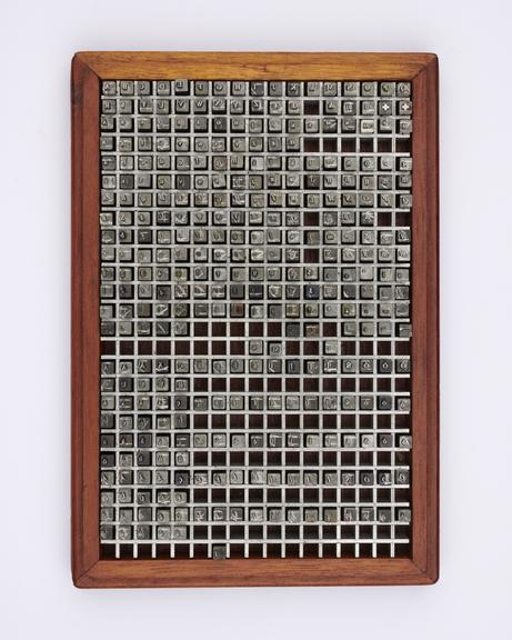
0.2 inch composition punches for Times New Roman (typeface series number: 327)

0.2 inch composition punches for Times New Roman (typeface series number: 327), font size 7.5. In an original wooden box and no suffix relating to the typeface is marked. Manufactured by Monotype Corporation.
A Monotype punch is made by tracing a pattern on a vertical pantograph machine. It is an engraved piece of hardened steel of a reverse-reading type character (letter, numeral or ornament) in relief from which the matrices are made. After cutting, the face of the punch was ground to the correct measurements denoted on the relevant chart. The punch was stamped into a piece of phosphor bronze that made a matrix from which type could be cast. Punches were made in standard sizes: 0.2" x 0.2", 0.4" x 0.4", 1" x 1", or 1" x 1.35". If a Monotype punch became damaged it could be replaced, identically, using the pattern.
Times New Roman was created by the esteemed typographer Stanley Morison, designer Victor Lardent and The Monotype Corporation. Morison had been challenged to produce a typeface for The Times newspaper that was economical with space and yet still highly legibility on newsprint pages. The first issue of the newspaper to use Times New Roman was 3 October 1932. The typeface was released commercially in 1933 and the Times New Roman family became one of the most widely used typefaces for books, journals and jobbing printing.
The typeface is narrow in relation to its large x-height. Its strong colour is given a crisp appearance by the sharply cut small serifs and subtle shading. Both Times New Roman and its companion bold combine vertical and diagonal stress. Capitals are vertically stressed, while the lowercase stress is mainly diagonal. The thickest parts of c and e are very low down. Counters are kept clean and open, and characteristic letterforms remain strong and legible even in the smallest sizes. The g has a wide tail. The capitals, being no higher than the short ascenders, are small and unobtrusive. The italic has a moderate inclination and has the serifs of the roman.
The Monotype Corporation made 24 series for the Times family in metal type including: a wide version, a semi-bold, an extended titling, four Greek series, a special version for small newspaper ads and a modified version with longer descenders for book work. The typeface had a full range of Cyrillic characters and what was at the time the largest range of accented characters for languages using the Latin alphabet.
Times New Roman was quickly licensed and produced by Linotype, Monotype’s main rival in mechanical typesetting systems. Years later other typesetting system manufacturers, and traditional typefounders Stephenson Blake, offered the typeface too. Times New Roman comes pre-installed as a core font with Windows and Mac computers and was the default font in English-language versions of Microsoft Word for many years. In 2004 the US State Department started using it on most of its documents. It is still available on personal computers for use by millions of people around the world. Times New Roman has had the greatest impact of any twentieth-century roman typeface.
Details
- Category:
- Printing & Writing
- Collection:
- Monotype Corporation Collection
- Object Number:
- 1995-1108/2664
- Materials:
- metal (unknown), steel (metal) and wood (unidentified)
- Measurements:
-
overall: 43 mm x 155 mm x 255 mm,
- type:
- punch - marking tool


